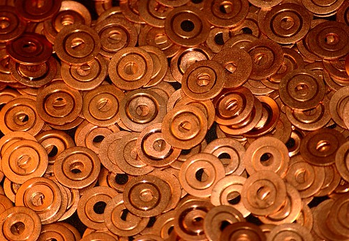
I took this graphic composition of these copper washers today. We use these washers at work all the time to make seals in the various tubings we use in our testing facilities. I swiped a bag full of used ones; that's why they all have that ring around the center. I was intrigued by the three circles they made: the inner diameter, the ring indentation, and the outer diameter. I also used this as an opportunity to experiment with my flash. I've been trying to learn how to effectively use my on-camera flash in manual mode--mostly for fill in harsh sunlight--and it's a lot more complicated than I thought. I imagine it will get worse when I get my hands on that SB-600 I've been eyeing.
An obvious image for the macro lens, but for now a telephoto at minimum focusing distance is effective enough.
Monday, April 30, 2007
Copper Washers
Tuesday, April 24, 2007
Joe Tucker Cemetery, Helena, AL

Here is a perfect example of seeing an image in my head, but not being able to reproduce that faithfully, either due to a lack of skill in the field or in post. When I came across this cemetery (adjacent to the park with the geese), I saw the long shadows cast in front of the tombstones and thought I could make use of that hard, directional light the sun was giving me. I envisioned in my mind's eye a black and white image emphasizing the dark shadows on the diagonal. The first thing that went wrong is the sky. In exposing for those shadows, the sky is completely blown out on the right side. It distracts the eye. Perhaps if I had exposed for the sky I would have been able to pull out the details in post-processing. The next thing that went wrong is in the black and white conversion. I used the channel mixer, as I usually do for this, but I've never felt comfortable with it. I decomposed the image to see the RGB channels independently, and there was something I liked about each, but didn't know how to mix them optimally. I ended up with mostly the green channel. The last thing I'm disappointed with is my use of curves. I tried to boost the contrast between the shadows and the grass, but I may have overdone it. And in doing so, I was hurting my already-blown-out sky. This would be a good candidate for a layer mask to apply the curve only to the lower part of the image, but I'm not comfortable with that at all yet, especially since all the tutorials I can find are for Photoshop, and all I can afford is the GIMP.
Three things went wrong:
(1) Incorrect exposure. I should bracket my exposures more, and always take at least some frames exposed for the highlights to see if I can extract some shadow detail later. Eventually I may want a graduated neutral density filter for situations like this.
(2) Poor use of channel mixer. Although I know how to use it technically, I'm still unsure of how to use it aesthetically. This will only come with practice and evaluation--doing it different ways then comparing.
(3) Poor use of curves and no use of masks. I really need to learn how to properly and effectively use layer masks in GIMP. This image may be a good one to come back to for practice.
Goose, Helena, AL

I went shooting in the park the other day and this goose decided to say hello.
I learned a hard lesson about dynamic range: the camera sees less range than the eye. Sure, I've read that a million times, but there's nothing like good old experience to make it really hit home. It's not so apparent in this photo, but most of the pictures I took were very harsh and contrasty, with the geese either in dark shadow or bright highlights, or both, and the camera couldn't handle it. I was there at around 4:30 p.m. on a clear day; the available light was very directional and hard, and was beginning to warm a bit. It could have been a good time to practice using the fill flash, if I could have gotten close enough to the birds. I didn't think of it.

Most of my education has been in math, science, and engineering, with some training in music. I was a musician all through high school and have recently, due to various circumstances, made a conscious decision to put down my trombone, trading it for the camera. Though photography has become my method of choice for creative outlet, I am still drawing constant parallels to music. As a lover of jazz, specifically bebop, I am always impressed by the amount of knowledge and effort bop demands of its listeners. One cannot expect to gain much by passively receiving Parker, Davis, Coltrane, Mingus, or Monk, without bringing along a certain amount of prior understanding as to how this music can express the thoughts of the musician. He must know the intricacies of musical communication, so that the musician and listener can have a common, agreed-upon language. Only then can communication take place, and the musician's statement be understood. Similarly, I can stare at an image for hours--it might even evoke an emotional response--but until I understand the language the photographer used to communicate, his statement is lost on me. Furthermore, until I can command the elements of visual communication for myself, making a photographic statement will be possible only accidentally. Just as J.J. Johnson spoke of a "jazz syntax" that must be mastered before effective, efficient improvisational communication can take place, so must photographers learn a visual syntax. We call such a syntax Composition.
So I have embarked on a path to learn a new language, to become visually literate and able to speak in this "syntax" of composition. Though this is a daunting task, as I must start from the absolute beginning, it is also exciting. There are certain images that have an effect on me; they strike me as having some sort of inexplicable significance or weight. Perhaps, with time, I will learn why; that is, I will learn to critically analyze a photograph and understand why it works compositionally. Perhaps, with more time, I will be able to produce work that has a similar effect. I believe this will be possible once two things occur: technique and camera manipulation are internalized, and graphic, compositional control becomes both comfortable and my main focus. They are interdependent; I cannot let the graphics of the image be the center of my attention until exposure, focus, and other camera manipulations become second nature.
The image I've posted today is of the Jule Collins Smith Museum of Fine Art on the campus of Auburn University in Auburn, AL, taken during the Easter morning twilight. It is my first image that I actually don't mind looking at, or showing to others. I like the idea of the half-light, half-dark building, though I wish that were more pronounced. I like the slight leading lines in the clouds and reflected in the water, though I wish they were stronger. I like the use of three strong colors: blue, yellow/gold, and the pinkish purple from behind the building on the right. But most of all, I like how my eye jumps between the two strong points of light within the frame: the bright light coming from the center of building, and the lamp post over to the right, with the reflection line sort of pointing to it. I wish I hadn't over exposed highlights coming from within the building; there's absolutely no texture in the brightest parts. Perhaps I could have emphasized the two strong points more in post by darkening the values over on the left side of the building (there were more lamp posts over there that were cropped out). Finally, I wish the line of symmetry wasn't centered right in the middle of the frame. I don't know for sure that it would have been successful higher or lower, but I kick myself for not taking more shots to experiment.
This has been a long post, which is not necessarily a good thing; I feel like I will be more likely to post more often if the posts are generally short. However, I think this process has been beneficial in that, for the first time, I feel like I have a direction to go in: simply reduce everything to points and frame. Of course, there's more to it than that--there are many photographic elements (lens perspective, depth of field, motion blur, etc) besides the purely graphic ones, and, unlike Kandinsky's work, my subjects actually do have meaning, but the end goal is for all three "photographic pillars," as it were--graphics, photographics, and subject--to work harmoniously towards some statement. And, for me, the most challenging and novel pillar by far is the graphic. My work is cut out for me.