Well, the transition is complete.
I've moved all my photographic "stuff" (and most everything else, too) from my Linux-based laptop to my new iMac. After reading The DAM Book, I was able to implement a system of tagging, cataloging, and archiving that will grow with my photograph collection; this mess I've had to go through of re-tagging and organizing all my photos should never happen again. The system is also set up for painless and frequent backups, which is something I've been meaning to implement for a while.
Fancy folder organization, exhaustive tagging, and expensive software don't mean a thing without photographic vision. Last week April and I saw an exhibition of the work of Harry Callahan in Atlanta. His work was remarkable, showing his mastery over line, shape, and tone. April pointed out two adjacent images obviously taken within minutes of each other. One, she noted, had a harsh, cold feel to it; light and dark had been pushed to such extremes that most detail was lost--all that was left was the white shape of his wife's body against a completely black background. The other was much more sensuous. Light seemed to wrap around her body, revealing nuanced detail in her skin. I told her that the difference in the photographs was not made by the camera--likely the two images were made with the exact same exposure. Rather, the vision was fulfilled in the darkroom, with the use of contrast filters and other light adjustment techniques such as dodging and burning.
I was recently asked by someone how the digital age and Adobe Photoshop was changing photography, and whether photography has become "more about Photoshop" and less about accomplishing things in-camera. I think such a question stems from two main factors: first, that yes, digital imaging has changed the photographic landscape in significant ways. Emails containing "photoshopped" images of bizarre or surreal scenes spread like wildfire through cyberspace, clouding people's idea of what Photoshop actually does for us. It's not just about composites, people. And when it is used for composites, it doesn't have to be about distorting reality. In my last post I showed a composite photograph that makes no attempt to be anything else. Photoshop allowed me to present those two images as a set, much like I would present them if they were printed and hanging on a wall. Though I could have done this in a traditional darkroom, it would not have been nearly as quick or precise.
The second main factor contributing to such questions is a lack of understanding of the kind of power the darkroom gave film photographers over their images. Photography has never stopped when the shutter closes; the real magic happens in the printing process. The darkroom, whether chemical or digital, gives us control over tonal values; essentially we decide whether to make parts of an image lighter or darker. That really is the essence of all darkroom work. The trick is knowing what needs its value changed, and then what that value should be. That decision is unchanged from chemical to digital darkroom. Where the digital darkroom excels is in giving the photographer real-time feedback on what his choices are doing to the image, with every step being completely editable and reversible. In a chemical darkroom, such steps are done on a "latent" image--which means you are staring at a white piece of paper until you actually develop it. If you don't like one of your steps, you have to do it all over again, which can be quite frustrating. So a digital darkroom like Photoshop gives us all the control film photographers have, but perhaps more nuanced, and also removes much of the frustration and uncertainty of working with a latent image, freeing us to work more creatively--not to mention it keeps us all from smelling like fixer all day. Great.
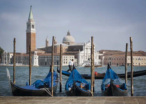
But, as I said before, Photoshop can't give you vision. Take the image posted here, for example. When I first started working on it, I wasn't sure where I wanted to take it. That's called lack of photographic vision, which is something I'm working on. After playing around with it for a while, I realized I wanted to take a lot of the color out and warm it up, leaving me with a yellowed desaturated look. I did some dodging and burning on the boats in the foreground and the buildings in the background, giving them more shape and bringing out details that otherwise were lost. I actually ended up mostly pleased with this image, though I'm sure it could be made much better in the hands of someone more skilled. What worries me is that I had to "play around" with the image before I realized where I wanted to go with it. Though I think that's ok for now, I eventually want to get to the point where I can look at a raw image and know exactly what I want to do with it; or better yet, know it before I even press the shutter. But for now, I am still learning the techniques, the possibilities, and the limitations.
Wednesday, November 14, 2007
iPhotoshop
Tuesday, November 13, 2007
Criticism
Wow. My mother recently saw this composite photo of my girlfriend April and myself. She said it was OK, but she would prefer it if I cropped out more of the space in in the center, bringing the two faces closer together. Certainly not the harshest of criticisms, but how difficult it was to hear! She's given me the same sort of casual suggestions before, and each time I have the same reaction: as she speaks I feel myself start to tense up, preparing for the blow and for my defense. I then start racking my brain, searching for some scrap of advice I had read somewhere that will justify my own take on the subject, thus proving her "wrong." She is not convinced. She then realizes I am not taking it well and not agreeing, then walks away muttering something like, "But I don't know anything about photography anyways." I am left discouraged.
This is not the proper reaction to have when being criticized. What kills me is that hers are such slight criticisms; as I continue with this effort I will certainly be critiqued harsher and more often--I better be ready with a good attitude and open ears. I think part of the problem with my reaction is that the critique is coming from someone so close to me; perhaps a stranger's words will not sting quite so much. But I think another, larger, part is my own poor response--no excuses. I am not used to being criticized at school or work, and my photography hasn't been seen by enough eyes to be seriously criticized either. So I am still learning how to cope with it and respond more positively. So please, anyone out there reading, criticize my photos! I need all the help I can get.
On a more positive note, tonight April told me a wonderful thing. She said that, since I've started pursuing photography, she's been exposed to the more artistic side of photographs, instead of the purely documentary images that fill every family's photo albums. This, in turn, has forced her to see her own world in a new way, arranging the figures in her landscape into some more aesthetic organization. This, of course, is exactly what photography asks us to do. I believe this was for her, as it was for me, an introduction to visual literacy, something most people our age are hopelessly deficient in. It's exciting that my interests, even if not my photographs, are having an impact on someone else, and that perhaps she and I could explore this subject of visual literacy together.
Sunday, September 23, 2007
Post Processing

I haven't taken a serious photograph since I returned from Europe on August 5.
But I'm okay with that.
When I came back, I had a large catalog of images that needed to be processed. In addition to all the images from the cities discussed in previous entries of Point and Frame, I had photographs from all the places I visited after I arrived in Oxford: London, Edinburgh, Zurich, Rome, Dublin, and Oxford itself. While stationed in Oxford, I spent my free time studying for classes and planning these weekend trips (they were not part of the larger study abroad group and were planned by myself and friends), with the understanding that my photographs would be processed when I arrived home.
Well, I got home and set out to pare down the catalog to the images I wanted to focus on, then opening them to convert the raw file and do my tonal corrections. I quickly realized how little I knew about digital post-processing. I had discussed this in an earlier entry, but I thought I had made some progress since then; it turns out not much. After churning out a few images like this one, I knew I needed help. So I consulted the podosphere, as I normally do, and found a wonderful podcast called Photo Walkthrough, produced by a man named John Arnold from the UK. His podcast is a series of video tutorials taking the viewer through the post production steps on a photograph, often spending a few weeks' worth of lessons on a single image. The lessons don't just focus on editing technique, which so many tutorials do, but rather they attempt to convey the why's of editing, which means I don't just learn how to do the technique, but when I should--much more valuable in my opinion. My eyes were opened again to the wonders of post-exposure processing, similar to the revelation I had during my short course on darkroom technique. The impact that a little dodging, burning, or contrast filtering can have on a photograph can be breathtaking when done right, and the superior control offered by a digital darkroom got me excited once again about the possibilities available. There's just one big problem: John Arnold, along with all other serious digital photographers, uses Adobe Photoshop.
Now anyone who knows me knows I am a staunch open-source software proponent. I'm currently typing this entry on a laptop running Ubuntu Linux as the operating system, and have done all my image cataloging with a great application called Digikam and image editing with the GIMP (an acronym for GNU Image Manipulation Program). All this software is open-source, meaning the code used to write it is available for modification or redistribution; free as in freedom, meaning there are no license agreements forcing you to only install on one machine, etc; and free as in free beer, meaning it costs no money at all to download and install any of these applications. These three characteristics, especially the last two, were enough to convince me to switch to a completely open platform, with no proprietary software (including Microsoft Windows) installed on my machine.
In order to follow the tutorials given at Photo Walkthrough and elsewhere on the internet or in books, I had to translate instructions for Photoshop into instructions for GIMP. Sometimes this was trivial, other times it was impossible. Basic tenants in Photoshop such as high bit depth for adjustment flexibility and adjustment layers for non-destructive editing were simply absent from the GIMP. As I delved deeper, I realized just how far the gap was between the two programs, and just how superior and more intuitive Adobe's application was. I found myself spending hours in GIMP attempting to do something I knew would take minutes in Photoshop. It frustrated me so much that I took the plunge: I gathered some money I had received from some relatives and purchased a 20-inch Apple iMac (2.4GHz Intel Dual Core, 2GB RAM, 750GB HDD), along with Adobe Photoshop Creative Suite 3.
As much as I lament the loss of Linux as my main computing platform--and it's not going anywhere, I still plan to run Ubuntu on my laptop--I do not regret my decision. Though the computer geek in me advocates using open-source software, the engineer in me always advocates using the right tool for the job. The artist in me tells me the right tool for my work is the Macintosh platform with Adobe Photoshop. I still maintain that for the vast majority of computer users with general needs (internet, email, documents, spreadsheets--even music management, image management, and image editing), open-source software more than suffices. But for specific needs such as those of serious digital photographers, the superior tools offered by Photoshop along with the iMac's full printer driver support and calibration abilities on the Cinema Display unfortunately make this the best solution. The iMac came in a few days ago and Photoshop shipped yesterday.
In the meantime, I've pretty much taken a break from photography. I figured it would be a waste of effort to work on these pictures before Photoshop arrives, so I haven't. I've realized that my love for photography has reached a much more sustainable level. At first, as in any blooming love, there was a feverish romantic flame, where I devoured anything about the subject I could get my hands on: from a philosophical discussion to gear reviews to tutorials to simply analyzing photographs. I was worried that, when the initial flame wore off, so would my interest altogether. But, after being saturated with shooting in Europe and still not being bored with it, I realized that my interest was staying for the long haul. I have the rest of my life to work on this subject, to read the tutorials and text books and practice composition, exposure, and post-processing. There's no rush. This is both a liberating and comforting realization. I know that, though I haven't taken a serious photograph in over a month, that's okay; it hasn't gone anywhere.
Saturday, June 23, 2007
En Route to Oxford

We just finished the touring portion of the trip and are on our way to Oxford, England for the remainder of the summer. We took our final exams yesterday (we take new courses once we get to England), and then some of us rented bikes and rode up to the North Sea. It was a lot of fun, even though it was raining. We ate lunch by the beach, then rode back. Last night I ate traditional Brugge mussels, had a waffle with whipped cream and chocolate sauce, and drank one too many local Belgian beers. It was great.
Brugge is a charming little town, an absolute gem among the European cities I've seen so far. The facades on the short little buildings were wonderful; combined with the cobblestone streets, the winding canals and bridges, and the local residents all on bikes, Brugge is a beautiful city. They are very proud of the their chocolate, their lace, and their fried potatoes (they were invented in Belgium, not France!), and you can find these in little shops and restaurants all over the city.
I did not take a single photograph in Brugge, despite its beauty. I think this may have been due to several factors. First, I wasn't there for very long. We stayed just two full days, the first of which I spent most of my time in my room studying for the exams, the second day was spent on a bike, in the rain (during which I was worried sick the whole time about my camera getting wet). That's fine; I don't regret. Brugge will just remain a little nugget of European beauty unphotographed.
Instead I'm posting here a picture from the island of Burano, just outside of Venice, Italy. This is the island I spoke of earlier, where the colors of the buildings are just overwhelming. I'm not sure I quite captured that here--the yellow looks a little dull--but that was my goal.
Tuesday, June 19, 2007
En Route to Brugge

We're now on our way from Berlin to Brugge, Belgium, with an overnight stop in Bielefeld, Germany. Berlin was an interesting city, saturated with history from WWII and the Cold War. I think it's safe to say no other city in the world still feels the presence of the Nazi's reign or the Soviet occupation like Berlin. Everywhere you turn there is some military or holocaust memorial, a hill made of rubble from WWII bombing, or some sign of the Berlin wall and the division and struggle that went along with it. The city is is more significant to Americans than any other city I've visited; of the four most significant events in recent American history--WWII, the Vietnam War, the Cold War, and the War in Iraq--Berlin played a major role in half of them. We spent a few hours at the museum at Checkpoint Charlie, reading the descriptions of events and pictures centered around the Berlin Wall and its one passageway. The extreme measures people took to cross this wall are quite moving, as are the psychological struggle of the Soviet border guards, many of whom did not want to be there are and intentionally shot over fugitives' heads. It's hard to think that it has come down less than twenty years ago, within my lifetime.
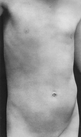
We spent some time in the Pergamon Museum, where I saw many great works of art, including the Temple of Zeus at Pergamon and the Ishtar Gates of Babylon, both of which were incredible. But the most striking work I saw was a statue, sculpted in stone, of a man I later discovered to be Apollo. There was nothing terribly remarkable about it--I've seen many male nudes on this trip--except for that all that was left of the original was the the torso: from just below the neck to the upper legs, no arms. The "cropped" subject and the contrapposto of his stance was strongly reminiscent of an Edward Weston photograph of the nude torso of his son. This is one of his most famous photographs, but the fist time I saw it I didn't know quite what to think. The boy is young and slender; the photograph is certainly not a celebration of man's strength or brawniness. Yet the photograph is still beautiful--a presentaion of the human form and stance with those wonderful slender dark shapes on each side. As I stared at the statue, which was absolutely a display of the strength of the perfect male form, thinking of all this, I was able to better put Weston's effort into historical context, giving me a much greater appreciation for the image. Weston, certainly, has thoroughly studied these ancient Greek and Roman forms (and all art since), and has internalized them to the point where they are second nature. He was able to stand in front of his nude son and frame exactly what he wanted, knowing full well (even though I didn't when I saw it) the reference he was making to Greek sculpture. The difference, though--and this is the wonderful thing about photography--is that this is no glorified human or god, and no figment of his imagination. This is a real person, his own flesh, really, with real human weakness. He was taking ancient sculpture and turning it around on itself, showing us not a beautiful woman or powerful god, but a weak adolescent, a subject we all know too well, for we all have been one. Michelangelo often scultped the hands of his subjects oversized (see his David), a reference to the idea that it is not he but God who is working through his hands. Weston comes back with this sort of surrogate self portrait and says no, I am not God, I am man, and this is my flesh. It's all very interesting.
Berlin was probably my most photographically successful city yet. I tried hard to stick with point, line, shape, form, pattern, texture, and color, and I think it paid off. At my current state of evaluation, I count seven keepers from just two days of shooting, including this one of the holocaust memorial. The graphic elements are obvious, and I had the sense to include a person on a thirds line to give it some scale. These blocks are arranged in ordered rows, and by choosing to arrange them on the diagonal the image gets a great sense of dynamism and motion, which is perfect because of how this art works: it is not something you look at, but something you move through. I really enjoyed this memorial. These cement blocks spread out in their rows for probaby close to half a city block. At the edges, they are no more than a few inches high. As you walk towards the center, zig-zagging through them in an attempt to get lost, the blocks get taller and the ground gets lower. All of it has an uneasy, imperfect feel to it--the ground is not flat nor inclined but rather is a series of unordered waves, and the blocks do not have perfectly vertical sides, nor do their tops line up evenly. At their tallest, we estimated them to be around 14 to 16 feet high. Once you move through the middle part and start coming out, the blocks get shorter again, more light gets let in, and finally you are at the edge where the blocks are barely above ground level. Moving through it is clear how relevent it is for a holocaust memorial. The victims of the holocaust were taken from their normal lives and thrown into the depths of some hell, organized but chaotic, surrounded by inpenetrable stone. Some of them survived, moving through the hell back into light. I don't think I've ever seen a work of art this abstract and this clear about its message. I was evesdropping on a tour guide who was explaining that the artist, a Jewish American, said there is no significance to the number or shapes of blocks (they don't represent tombstones or number of people that died, for example), they are purely abstract elements to convey the emotion. Apparently the artist came to visit it a while ago, and was moved by seeing very diffent reactions to his work: some people were weeping, leaving flowers by the blocks, while a little further down children were running through them, playing games.
The travel portion of this trip is pretty much over. We will spend two days in Brugge, most of which will be spent studying for our final exams, before heading to Oxford on Saturday, the 23rd. We'll stay there until about the first week in August, then I fly home. Although I've enjoyed the traveling, it will be good to get some stability back in my schedule. I plan to take some trips on the weekends (we get three day weekends every week), but I also want to explore Oxford thoroughly.
I miss my girlfriend.
Friday, June 15, 2007
En Route to Berlin
We're now on the bus, four hours away from Berlin. Prague was an interesting city, a world apart from more western cities like Paris and Vienna. The Soviet influence is still strong here; you can see it in the faces of the people. The older generation in Prague looks hardened with chiseled faces, as if they've drowned years of hardship with beer and vodka. Their dark wrinkles tell the story of the struggle for freedom. The younger generation, though, show a vibrancy not yet touched by that struggle. The women here are beautiful, wearing flirty skirts and low-cut blouses as they strut down the street in pairs. Are they the first generation to escape the hard life, or are they just starting down that path? Time will tell.
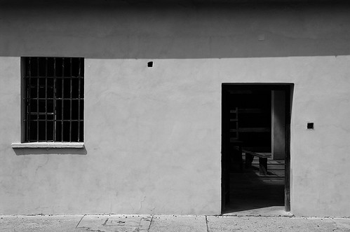
A generation before the Soviet rule there was Nazi influence. Wednesday we went to a former concentration camp in a town called Terezin, about an hour outside of Prague. Terezin started out as a sort of military base in the Austro-Hungarian empire, later held POWs and other military and political prisoners, and in the forties under Nazi rule it held many Jews and others of an "inferior race." The whole place was quite eerie. We saw the places where these prisoners slept, ate, were executed, and were cremated. The photo here looks into one of the eating halls, and if I remember right it also doubled as and overflow bunker. It was like a sort of ghost town; it was empty with cobwebs everywhere, and this sort of musk pervaded every room. I felt uneasy the whole time.
Photographically, Prague was yet another failure. I took pictures of the city, but my pictures cannot speak for the city. I tried to get up this morning and shoot from the famous Charles's bridge before dawn (the sun rises at 4:50 a.m. in Prague), but completely overslept. My suspicions before I left for Europe have pretty much been confirmed: that I am photographically not ready for an opportunity like this trip. I feel like I'm trying to sit in with Thelonius Monk when I know my scales and a little theory, but I can't really say anything with my horn yet; I can't put it all together and construct a successful solo. That's not to say I'll give up trying, but there's only Berlin and a short stay in Brugge left for the traveling portion on this trip, and I don't see anything short of a miracle that will allow my skill and photographic eye to improve enough to make those cities successful.
As I read through what I just wrote, it sounds awfully depressing, but I want to make it clear that I am not going around sulking about my boring pictures, and that I most certainly am having a great time on this trip. One thing I believe I have been successful with is separating my photographic pursuits with my enjoyment of Europe. The whole experience has been no less than amazing. The people I'm with are great, and the places I've seen are breathtaking. Last night we went to see Mozart's Don Giovanni in a beautiful opera house (we had good seats!) in the city where it premiered in the 18th century. Afterwards we ate ice cream on a bench in the main city square and just watched people go by on a busy night. That kind of experience is priceless, and I honestly don't care that I don't have a photograph of it.
However, my work is cut out for me when I get back home. I now feel very comfortable with the controls and limitations of my camera, and should be able to focus exclusively on the creative process at home, in locations I am familiar with. By the next time I'm in a special place like this, I should be able to instantly recognize the graphic elements of point, line, shape, form, pattern, texture, and color, and make effective use of the photographic elements like depth of field, motion blur, point of view, and perspective/lens choice. I cannot photographically "waste" another opportunity like this (although I doubt another quite like this will ever arise).
You know, come to think of it, this is a good thing for me photographically, even though I don't consider it a success. Under what other circumstance would I be practically forced to a) Take many photographs everyday, and b) Constantly evaluate the success of those images and my progress as a photographer? I can think of none. If were taking classes in Atlanta right now I'd be lucky if my camera came out of the bag once a week. There has been definite progress in my both my skill as a photographer and my ability to evaluate myself, though that may not be obvious in the images. In that sense, the trip is a photographic success, even if there are few successful images.
OK, I've rambled long enough, and I'm running out of battery on my laptop. Wilkommen in Deutschland!
Monday, June 11, 2007
En Route to Praha

On the bus again; we just crossed the Austria-Czech border. They checked our passports, and took three of ours in for further evaluation (an Indian, Kenyan, and Chinese passport). Former Soviet Union, here we come.
Vienna was a very cool city, the most modern yet. Although it was probably no bigger than Paris, it felt more expansive, with larger, newer buildings and wide streets. I got my share of sausage, wienerschnizel, and Austrian beer. I liked that city.
Photographically, I don't think I have any real keepers (though I haven't spent much time evaluating). I felt very frustrated the whole time. I was here in this cool city but couldn't really "capture" it, whatever that means. Part of the problem was that we didn't actually stay in the city (we were in a similar situation in Venice). Although the food at the hotel was great (it was connected to the Vienna airport), it was a 30 min/1.70 euro train ride just to get into the city, and another U-Bahn ride to get anywhere once inside. With lectures everyday at 8:00 in the morning, there was no way to go out shooting in the morning before dawn and make it back in time. That's by far the best time to shoot: amazing light and no tourists. After an 8:00 lecture and a 10:00 museum, that put my first batch of free time right at noon, the absolute worst time of day to take pictures. So I didn't. In the evenings the light was better, but the whole place is still tourist-laden, and it's much harder to separate from the group. I took pictures, but they are mostly uninteresting.
So that's one excuse, outside my control, for the bad pictures. The second reason is completely within my control. I feel like I have no driving force for photography, as if I'm just shooting what "looks cool" as opposed to having a definite purpose or statement. I've said in previous posts that I want to take more portraits, and that still stands, but I want something else, something that can show "Vienna" (or "Prague" or "Berlin") interestingly--something pleasant to look at, something worth exploring visually. Anyone can (and I certainly do) take pictures of a random city street in Vienna, but what makes that Cartier-Bresson image of a Parisian street special, more visually interesting? In trying to figure it out, I realized where I've lost focus--the very basics, the whole point and title of this blog: Point and Frame. That is to say, graphics: point, line, shape, form, pattern, texture, color. Forget color and shoot in black and white, and I'm left with six graphic elements to exploit in every photograph. No more random shots. I've been using the camera every day, and am now much more comfortable getting an accurate exposure with little effort. I understand my dynamic range capabilities much more, and as a result am worrying less and less about getting the photograph technically "right." This leaves room for me to explore the photograph more creatively, exploring those graphic elements. I should exploit this new freedom as much as possible. There are graphic elements everywhere, and it is left to me to edit out that which does not contribute. If I can let that be my focus within these foreign cities hopefully my photographs will both document the space and be interesting to look at. That's all I really want, now that I think about it. Interesting documentation.
This picture was taken just inside the doorway of some theater as we tried to escape the rain on our way to an orchestra performance of Mozart, Brahms, and Ravel (which was excellent, by the way). Umbrellas have always fascinated me, these little domes people carry around with them for shelter; a street full of people in the rain looks like a pile of marbles or something. I've always wanted to photograph them, but they present an extra challenge because digital cameras and rain don't get along too well. Although I think the composition here is quite distracting, not very balanced, and in general could be much better, I do like the repetition in the dome of the church and the dome of the lady. That may be something to look into for future projects.
Onward to Prague, where I'll be able to pronounce nothing and I'll have no idea what anything costs (I think it's 20 crowns to the dollar?). My focus should be point, line, shape, form, pattern, texture, color. And portraits.
Thursday, June 07, 2007
En Route to Wien
I'm writing this post from a hotel in Klagenfurt, Austria, where we are staying for the night as we make our way from Venice to Vienna. Venice was a town certainly unlike any other on earth--a city that by all logic shouldn't even exist, yet has flourished as a center of culture and art for hundreds of years. A port city, you can find architectural influences from the east and the Byzantine empire, as well as the Romanesce influences found throughout Italy. We stayed at a smaller city named Padua (Padova), about a half hour's train ride outside Venice. The first time I walked out of the Venician train station and down the steps, it was like stepping into a whole new world. It feels like you are standing at the edge of a street, yet there is no street, only water. And there are no cars, only boats. No crosswalks, but bridges. It is unreal. I watched a construction crew operate heavy machinery from their boat. I watched a postman zip down the canal in his motorboat. I watched a blue police boat speed by with sirens blaring. Although interesting to watch it was almost unsettling how foreign it all was. In addition, the city is an absolute maze to get around in--nearly impossible to navigate. I wished we had spent a little more time there to get a better feel for the place.
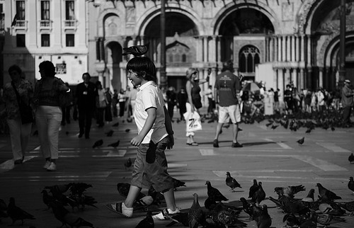
On our last day in Venice we went to the glass-making island of Murano and the lace-making island of Burano. Murano was nice; the glass there was absolutely beautiful (though quite expensive for the larger stuff) and we got to see a demonstration of the glass blowing, which was interesting. Burano, though, was a photographer's dream. Every building on that small island was painted a deep, saturated, solid color. A bright red house next to a deep blue house with red flowers in the middle, next to a dark green store with yellow shutters on the windows. It was wonderful. By the time this gets posted, some pictures of Burano will hopefully be on my Flickr page. The picture I'm posting here was taken in San Marco Square, the social hub of all Venice. With the San Marco Cathedral in the background and Doge's Palace to the left, the square is constantly full of people (Venicians and tourists alike), and there are usually at least two pigeons for every human out there. If you have any bread or seed they will surround you and eat directly from your hand. This young boy was having a great time with the birds; I snapped off a few frames, and was satisfied with this one.
As I said in the last post, I wanted to take more portraits. In Venice, I was able to get some shots of a street clown (who posed quite dramatically for me when I asked if I could take his portrait), a street musician, a lace maker on Burano, and waitress/owner of a wonderful restaurant I ate at on my last night (I had spaghetti with clams, cuttlefish in ink with polenta, fried potatoes, and red wine). I haven't look real hard a post-processing them yet, but I have a feeling none were terribly successful. Still, I know that's what I'd like to do more of; it would take my summer portfolio to an entirely new level.
Tomorrow we head into Vienna, the home of Haydn, Mozart, and Beethoven. I hope to get my fill of sausage, beer, and classical music.
Thursday, May 31, 2007
Prego

Well we're a few days into Florence now, and the longer I stay here the more I like the city. It is not very big, but it's dense with tourists, local residents, street vendors, pizza, and most importantly, gelaterias. It has its own rhythm, completely different from that of Paris, and a world apart from anything in the States. You can wander in circles for hours, going back and forth across the bridges or making ever-widening circles around the Duomo, dodging the small cars and vespas as they tear through the tight streets, perusing the "fine" purses and art for sale on the sidewalks, and eating pizza at the base of a centuries-old building. That's exactly what we did this evening, after a morning of taking a long hard look at Michelangelo's David and Masaccio's work on the panels in the chapel of the Santa Maria del Carmine, some of the finest pieces of art in the world. Florence is rich in that kind of cultural history, and is very aware of it--sculptures can be found randomly on street corners or in front of buildings, and the city in general is proud of its museums and amazing churches.
Well, photographically, I have done better about taking the touristy shots. I feel good about it. I'm still not being as creative with the photographs as I'd like, but its getting better. I feel confident that I was right in thinking that simply pressing the shutter more is going to get me thinking more photographically. I have plenty of throw-aways, too, but some keepers I think. This isn't quite the same strategy as the "take a million shots and hopefully one of them will come out," which I strongly disagree with. I'm approaching it with more of a "pick the camera up, take some tourist shots to get you looking through the viewfinder, and maybe you'll start to see something more graphic." I think its working, and should only get better as I move forward, getting less self-conscious about laying on the floor to get a shot, or staying behind the group when there's good light.
I'm finishing this post on the bus as we make way to Venice. I'm excited that all the winding canals will make for some graphic images. There's one more thing I'd like to incorporate into my images: portraits. There were so many interesting people in Florence doing interesting things that I'd love to photograph, but I never got the courage to ask them. I took some portraits of friends, which I'm satisfied with and hope to continue, but how great would it be to get portraits of street vendors, gelateria workers, couples on the street and Italian policemen? That would be a sure way to add something extra to the "touristy" shots, but it will take some courage and technical confidence--I can't be fiddling with my camera as I try to do this. Onward to Venice.
Tuesday, May 29, 2007
En Route to Firenze

We are currently on our way to Florence, Italy. I'm am participating in a study abroad program for school, and will be in Europe all summer. We left Paris yesterday after spending four days there, and spent last night in a small valley town named Chamonix in the French Alps. After Florence, we will visit Venice, Vienna, Prague, Berlin, and Brugge. For the second half of the summer, we will be on the Worcester College campus in Oxford, England.
After a slight snag in the beginning of the trip (I couldn't get a passport in time to leave with the rest of the group, and had to fly out the next day) I arrived in Paris safely. I had high hopes for this trip photographically. I wanted to capture both the experience I was having, as well as the "essence" of the city, as cliche as that sounds. I did not want the normal touristy shots. Unfortunately, I believe I utterly failed at this in Paris, which is unfortunate because it is one of the liveliest, most photographic, and simply most amazing places I've ever been. Yet, I hardly took my camera out of the bag. Why? Well, I've deduced it down to two main issues.
1) I don't want to take the touristy shots. My determination to avoid bland tourist "I was there" shots led me to take very few shots at all. Every place I went I saw beautiful sights, and hundreds of people pointing cameras at them. I knew that if I picked up my camera, I would be taking the exact same shot, adding nothing new, nothing interesting, nothing graphic or photographic, simply the same boring shot. So I didn't pick up my camera, and consequently have very little to show of my experience, touristy or not.
2) I travel mostly with groups of 4 to 8. Now, this is great, because this trip is certainly about more than photographs. There are some wonderful people on this trip with me and I've really enjoyed meeting new people and getting closer to those I've know before. However, this is about the worst situation to be in photographically. Groups in general (the exception being groups of photographers) move too quickly to do a photographic subject justice. Tourists snap a frame or two and move on; they've satisfied their photographic need; they've "got it." To truly photograph a subject, though, one needs to spend time with it, learn it and its details and approach it from many viewpoints and angles. This, of course, takes the kind of time a large group doesn't have. So, as a photographer in a group of non-photographers, I have a choice. Go through the photographic process, and hold up the group and risk being left behind, or just take the tourist shot with everyone else and move on. Neither option seemed sufficient, and I ended up with no pictures.
So what's the solution? Well, I've decided to try two things, both of which compromise my initial ideals. First, I've decided to take the tourist shots. Let's not fool ourselves, I am a tourist, after all. Even if the photograph has no more of a statement than "This is what the Eiffel Tower looked like," that should now be counted worthy enough to snap the shot. I've got to start releasing the shutter more, and quit worrying about whether I'm taking the shot as a "photographer" or as a "tourist" --stupid labels anyways. Even if I don't get the shots I want, at least I'll have something to show for it. And, once I get the photographic juices flowing (which will never happen until I look through the viewfinder), who knows--maybe something will happen. I guarantee it won't happen if my camera stays in the bag.
This second compromise is to occasionally leave the group. I would like to set aside some time in each city--preferably towards the end of my stay--for myself, to photograph some part of the city alone. With all my bland snapshots, I should be able to narrow down what I think deserves the most attention. I'd like to then go back and explore that subject more, finding out what it is I really respond to. This can only be done alone, which is unfortunate because enjoy being with the people so much. The people I've joined up with really are wonderful people, and these places I'm visiting would be far more boring without them. I do not want to leave the group, but I feel the social sacrifice will certainly be worth it, if I am able to explore these incredible scenes more closely. This effort will certainly be harder than the first: I can reluctantly force myself to take the tourist photo, but it will be difficult for me to turn down an offer to go with a group to be by myself with my camera. Well it sounds kind of sad when I put it like that. I hope they understand.
I'm finishing this entry at 2:00 A.M. the next morning in Florence. We took a walk through the city at sunset, and ate in a pretty nice restaurant: we had penne with beef sauce, pork tenderloin, white beans, and the most amazing tira misu I've ever had in my life. From here on out, it's gelato every day.
Buonanotte!
Monday, May 21, 2007
Backlit Tree

A while ago I came across this tree in my front yard that had wonderful afternoon-sun backlight. Each leaf had a remarkable luminance to it not found in any of the adjacent trees. After several unsuccessful shots of the whole tree (and the rays of light coming through it on the ground), I decided it was better to eliminate the distracting background and go in closer. I ended up with this composition, from under the tree looking up. I knew I wanted it to be in black and white, to try and emphasize the light values that attracted me to the scene, as opposed to the colors.
At first I was very disappointed with this image. Due to looking directly into the sky, most of the background/sky parts are completely blown out, beyond the range of the camera. The worst of that has been cropped out here. Also, I didn't feel like I captured that original luminance I saw. My girlfriend called the image "uninteresting" and preferred the raw file in color, and perhaps she's right. But the more I look at it, the more it grows on me--at least a bit. I do rather like the tones in the leaves, and the wash of bright light in the background, though possibly distracting, is accurate in the sense that it was much brighter than the leaves I was focusing on (it was backlit, after all). I like how, compositionally, the pathway of the eye is controlled: My eye enters from the left, travels across the line of ivy toward the center of the frame, jumps up to the triangular shape of oak leaves on the right, then back down the tree trunk. Another viewer's pattern may differ, but I still think the composition is graphically strong, despite the large array of lines in the background.
In short, this is an image which I'm not entirely dissatisfied with, though I'm not entirely satisfied with, either. I know the scene had potential that could have been brought out by a better photographer. I chalk this on up to one more step on my path to total photographic control.
Sunday, May 06, 2007
A Study on Flash
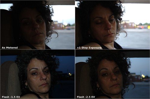
Like I posted earlier, I've been trying to learn how to use my flash effectively. I'll be going to Europe in a few weeks, and I want to be able to use my on-board flash in low light without having my pictures come out...well..."flashy."
The other evening when Mom and I were waiting on the bats (see "Panning" below), I twisted around and quickly metered and shot a snap of my mom (top, left above). The meter apparently favored the light coming from behind her through the window, and her face turned out dark in comparison. "No matter," said I as I slowed the shutter speed down by a stop and shot again (top, right). Although the tones in her face look good, the background is way overexposed, as was expected.
"Well," I thought, "this may be a good time to pop up the flash and give it a whirl." In this situation I would be using the flash as the main source of light as I try to balance it with ambient. Based on the advice given by Strobist.com as a good starting point, I stopped down by two stops, then turned the flash compensation down by 1.5 EV (bottom, left). We're getting closer. The values are more balanced--nothing is terribly over- or underexposed--but it has that dreaded "flashy" look; the tones are cold and very flat. It has an almost sickly feel to it. Being as close to her as I was (I was in the passenger's seat), I thought I'd turn the flash down another stop and see what happens. Bingo! The tones are much more balanced, detail can be seen in the subject and background, my mom doesn't look ill, and everybody's happy (bottom, right).
None of these are good pictures. The composition is not all that interesting, and Mom looks like she is about to fall asleep. I tried to keep post-processing to a minimum in order maximize the differences between the four images. I probably could have tweaked the flash and exposure settings more and gotten an even better shot. At the time, I was so overwhelmed by the vast differences between the images I just wanted to see them on a larger screen immediately, and didn't think to keep messing with it. Still, as an exercise I think it was quite instructive to ignore all the other variables (composition, post, etc) and focus on the one I'm trying to learn: flash.
So, what did I learn? Well for starters I learned that it is possible to non-flashy images with a flash, it just takes some effort. That's important, because up till now I thought that my lack of skill combined with my dinky little on-camera flash (which gets a really bad wrap in photography circles) would mean that good shots in low light were just impossible. Now I think my flash has some potential that I need to squeeze out before I squeeze $185 out of my wallet on new one. I also learned that the tip I got from Strobist works: when using flash as the main light source, underexpose by a couple of stops and dial the flash down 1.5 to 2.5 stops. And finally, I learned that camera-to-subject distance has a huge effect on the necessary flash output. Sitting this close to the subject -2.5 EV was plenty of light; had I been further away, it may not have.
Saturday, May 05, 2007
Panning
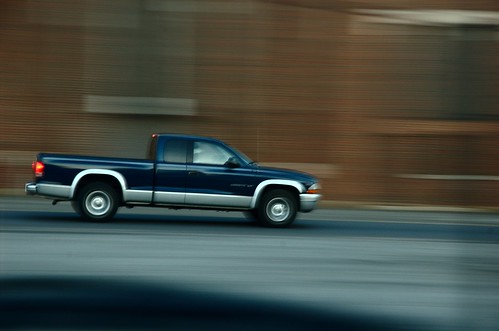
Last Tuesday my mom and I went to Bessemer, AL, where she said she had seen a large amount of bats coming in and out of a small tower on the high school football stadium the week before. We eventually did see a few bats, though not very many, which would have made it difficult to photograph successfully in the dark--there was very little contrast between the few small bats and the dusky sky. So, while we waited for the bats I saw an opportunity to practice the panning technique on the cars that went by in front of the stadium. Out of the seventy or so exposures I made, this one I deemed the best, which gives you an idea of how successful (or rather, unsuccessful) I was. It was more difficult than I thought! I was sitting down, taking the pictures from inside the car (you can see the dash in the lower portion of the frame). I'd like to try it standing up to see if that makes a difference.
Monday, April 30, 2007
Copper Washers
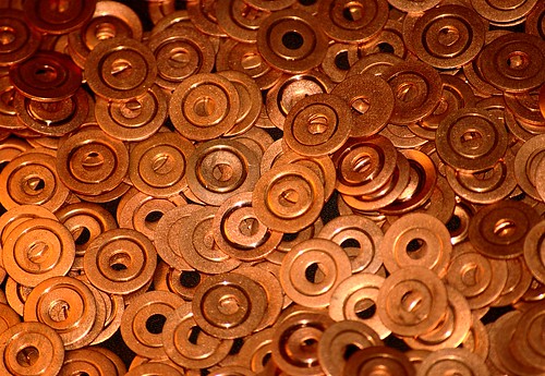
I took this graphic composition of these copper washers today. We use these washers at work all the time to make seals in the various tubings we use in our testing facilities. I swiped a bag full of used ones; that's why they all have that ring around the center. I was intrigued by the three circles they made: the inner diameter, the ring indentation, and the outer diameter. I also used this as an opportunity to experiment with my flash. I've been trying to learn how to effectively use my on-camera flash in manual mode--mostly for fill in harsh sunlight--and it's a lot more complicated than I thought. I imagine it will get worse when I get my hands on that SB-600 I've been eyeing.
An obvious image for the macro lens, but for now a telephoto at minimum focusing distance is effective enough.
Tuesday, April 24, 2007
Joe Tucker Cemetery, Helena, AL

Here is a perfect example of seeing an image in my head, but not being able to reproduce that faithfully, either due to a lack of skill in the field or in post. When I came across this cemetery (adjacent to the park with the geese), I saw the long shadows cast in front of the tombstones and thought I could make use of that hard, directional light the sun was giving me. I envisioned in my mind's eye a black and white image emphasizing the dark shadows on the diagonal. The first thing that went wrong is the sky. In exposing for those shadows, the sky is completely blown out on the right side. It distracts the eye. Perhaps if I had exposed for the sky I would have been able to pull out the details in post-processing. The next thing that went wrong is in the black and white conversion. I used the channel mixer, as I usually do for this, but I've never felt comfortable with it. I decomposed the image to see the RGB channels independently, and there was something I liked about each, but didn't know how to mix them optimally. I ended up with mostly the green channel. The last thing I'm disappointed with is my use of curves. I tried to boost the contrast between the shadows and the grass, but I may have overdone it. And in doing so, I was hurting my already-blown-out sky. This would be a good candidate for a layer mask to apply the curve only to the lower part of the image, but I'm not comfortable with that at all yet, especially since all the tutorials I can find are for Photoshop, and all I can afford is the GIMP.
Three things went wrong:
(1) Incorrect exposure. I should bracket my exposures more, and always take at least some frames exposed for the highlights to see if I can extract some shadow detail later. Eventually I may want a graduated neutral density filter for situations like this.
(2) Poor use of channel mixer. Although I know how to use it technically, I'm still unsure of how to use it aesthetically. This will only come with practice and evaluation--doing it different ways then comparing.
(3) Poor use of curves and no use of masks. I really need to learn how to properly and effectively use layer masks in GIMP. This image may be a good one to come back to for practice.
Goose, Helena, AL

I went shooting in the park the other day and this goose decided to say hello.
I learned a hard lesson about dynamic range: the camera sees less range than the eye. Sure, I've read that a million times, but there's nothing like good old experience to make it really hit home. It's not so apparent in this photo, but most of the pictures I took were very harsh and contrasty, with the geese either in dark shadow or bright highlights, or both, and the camera couldn't handle it. I was there at around 4:30 p.m. on a clear day; the available light was very directional and hard, and was beginning to warm a bit. It could have been a good time to practice using the fill flash, if I could have gotten close enough to the birds. I didn't think of it.
Wednesday, April 18, 2007

Saturday, March 31, 2007
Photographers As Editors

I've been chewing over this concept that has made it into my reading from several sources seemingly all at once: the idea that photographers are not creators. This is not to say that we are not creative, but rather that we are not a creating. We are not like the painter, author, or composer staring at a blank canvas or page, having to create something from the emptiness. No, we start with creation--nature, people, architecture--and take it as given. We are also unlike the musician or actor. They must take some other artist's creation and interpret it until it becomes his own.
Although we may see the given creation in a unique way, our job is not to interpret it for others; we simply see it.
No, we are not creators or interpreters. What we do is take in the given creation in a unique way, and find in that something we would like to show to others. Once found, we attempt to isolate that something, stripping from the frame everything that is extraneous. In that sense we are editors, editing creation to isolate its essence. I believe this single outlook on my role as a photographer could serve me well. I should ask myself on each exposure: "What part of creation am I trying to isolate, and how can I best do that?" If I can answer those questions, my images will have more direction and meaning. If I can't, my images will be confusing and crowded. I must constantly edit my work, stripping out that which is not needed.
This image of the azaleas in my front yard started much wider, including the green shutter and rectangular panes of glass of my front window behind the bush. As I took several frames that seemed to hold no interest, I realized that what I cared about was the beautiful color of the flowers, and eventually zeroed in on that. After editing out the creation I didn't need, I ended up with this image, which I believe to be far more successful.
Tuesday, March 27, 2007
Gold and Blue Macaw
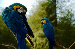
This is one of the handful of images I was able to get at the zoo last Saturday before my camera battery died on me. Needless to say, I put in an order for a second battery the minute I got home. I also vowed to never let that happen again. I guess I had to learn the hard way.
In all, though, it was a fun trip; more enjoyable than I had anticipated. I think April was actually glad the battery died--it meant I wouldn't be constantly holding us up trying to get the shot.
Most of my education has been in math, science, and engineering, with some training in music. I was a musician all through high school and have recently, due to various circumstances, made a conscious decision to put down my trombone, trading it for the camera. Though photography has become my method of choice for creative outlet, I am still drawing constant parallels to music. As a lover of jazz, specifically bebop, I am always impressed by the amount of knowledge and effort bop demands of its listeners. One cannot expect to gain much by passively receiving Parker, Davis, Coltrane, Mingus, or Monk, without bringing along a certain amount of prior understanding as to how this music can express the thoughts of the musician. He must know the intricacies of musical communication, so that the musician and listener can have a common, agreed-upon language. Only then can communication take place, and the musician's statement be understood. Similarly, I can stare at an image for hours--it might even evoke an emotional response--but until I understand the language the photographer used to communicate, his statement is lost on me. Furthermore, until I can command the elements of visual communication for myself, making a photographic statement will be possible only accidentally. Just as J.J. Johnson spoke of a "jazz syntax" that must be mastered before effective, efficient improvisational communication can take place, so must photographers learn a visual syntax. We call such a syntax Composition.
So I have embarked on a path to learn a new language, to become visually literate and able to speak in this "syntax" of composition. Though this is a daunting task, as I must start from the absolute beginning, it is also exciting. There are certain images that have an effect on me; they strike me as having some sort of inexplicable significance or weight. Perhaps, with time, I will learn why; that is, I will learn to critically analyze a photograph and understand why it works compositionally. Perhaps, with more time, I will be able to produce work that has a similar effect. I believe this will be possible once two things occur: technique and camera manipulation are internalized, and graphic, compositional control becomes both comfortable and my main focus. They are interdependent; I cannot let the graphics of the image be the center of my attention until exposure, focus, and other camera manipulations become second nature.
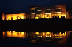
The image I've posted today is of the Jule Collins Smith Museum of Fine Art on the campus of Auburn University in Auburn, AL, taken during the Easter morning twilight. It is my first image that I actually don't mind looking at, or showing to others. I like the idea of the half-light, half-dark building, though I wish that were more pronounced. I like the slight leading lines in the clouds and reflected in the water, though I wish they were stronger. I like the use of three strong colors: blue, yellow/gold, and the pinkish purple from behind the building on the right. But most of all, I like how my eye jumps between the two strong points of light within the frame: the bright light coming from the center of building, and the lamp post over to the right, with the reflection line sort of pointing to it. I wish I hadn't over exposed highlights coming from within the building; there's absolutely no texture in the brightest parts. Perhaps I could have emphasized the two strong points more in post by darkening the values over on the left side of the building (there were more lamp posts over there that were cropped out). Finally, I wish the line of symmetry wasn't centered right in the middle of the frame. I don't know for sure that it would have been successful higher or lower, but I kick myself for not taking more shots to experiment.
This has been a long post, which is not necessarily a good thing; I feel like I will be more likely to post more often if the posts are generally short. However, I think this process has been beneficial in that, for the first time, I feel like I have a direction to go in: simply reduce everything to points and frame. Of course, there's more to it than that--there are many photographic elements (lens perspective, depth of field, motion blur, etc) besides the purely graphic ones, and, unlike Kandinsky's work, my subjects actually do have meaning, but the end goal is for all three "photographic pillars," as it were--graphics, photographics, and subject--to work harmoniously towards some statement. And, for me, the most challenging and novel pillar by far is the graphic. My work is cut out for me.